플렉스박스( flex box )란?
CSS에 유연한 박스 레이아웃 모델이 소개되기 전에는 레이아웃을 만들 때 에러를 유발할 것 같은 해킹스러운 다양한 방법이 존재했다.
플렉스 박스는 레이아웃이 동작하도록 만들기 위해 일반적으로 제공해야 하는 많은 프로퍼티를 추상화하여 이를 개선했다.
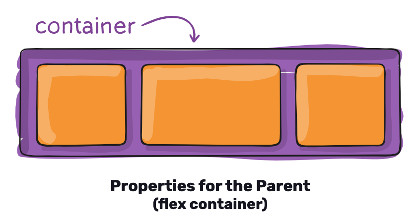
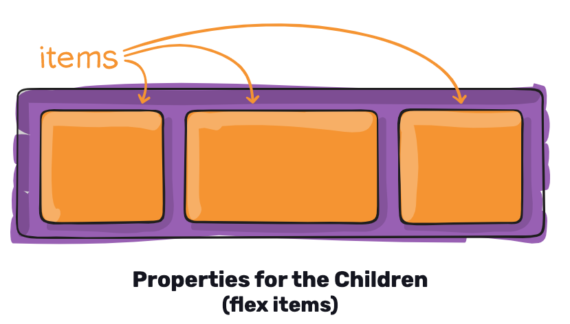
플렉스 박스는 이름에서 볼 수 있듯이 유연한 박스 모델이다. 컨테이너 역할을 하는 박스가 있으며 박스 내에는 자식 요소들이 있다.
( 이 부분만 놓고 보자면 안드로이드 상에서 LinearLayout이 생각났는데 선형 레이아웃보다는 flex라는 이름에서 더 유연할 것이라는 생각을 해볼 수 있다. )
플렉스박스 개념에 대한 상세정보는 링크를 통해 확인할 수 있다.
플렉스 박스 styles.js 정의
간단한 예제를 통해 플렉스박스를 살펴보자.
create-react-native-app my-app을 톨해 생성된 패키지에 styles.js를 생성한 뒤 다음 코드를 작성한다.
import { StyleSheet } from 'react-native'

const styles = StyleSheet.create({
    container : {
        //플렉스박스 레이아웃 모델 활성화
        flex : 1,
        //간격을 다른 자식을 참고해 정의한다.
        justifyContent : 'space-around',
        //자식을 컨테이너의 중앙에 맞춘다.
        alignItems : 'center',
        backgroundColor : 'ghostwhite',
    },
    box : {
        width : 100,
        height : 100,
        justifyContent : 'center',
        alignItems : 'center',
        backgroundColor : 'lightgray',
    },
    boxText : {
        color : 'darkslategray',
        fontWeight : 'bold',
    },
});

export default styles;
플렉스박스 렌더링
App.js에서 다음 작업을 진행한다.
import React from 'react';
import{
  Text,
  View
} from 'react-native';
import styles from './styles'

const StyleSheets = () => (
  <View style = {styles.container}>
    <View style = {styles.box}>
      <Text style = {styles.boxText}>
        I'm in a box
      </Text>
    </View>
  </View>
);

export default StyleSheets
실행 결과
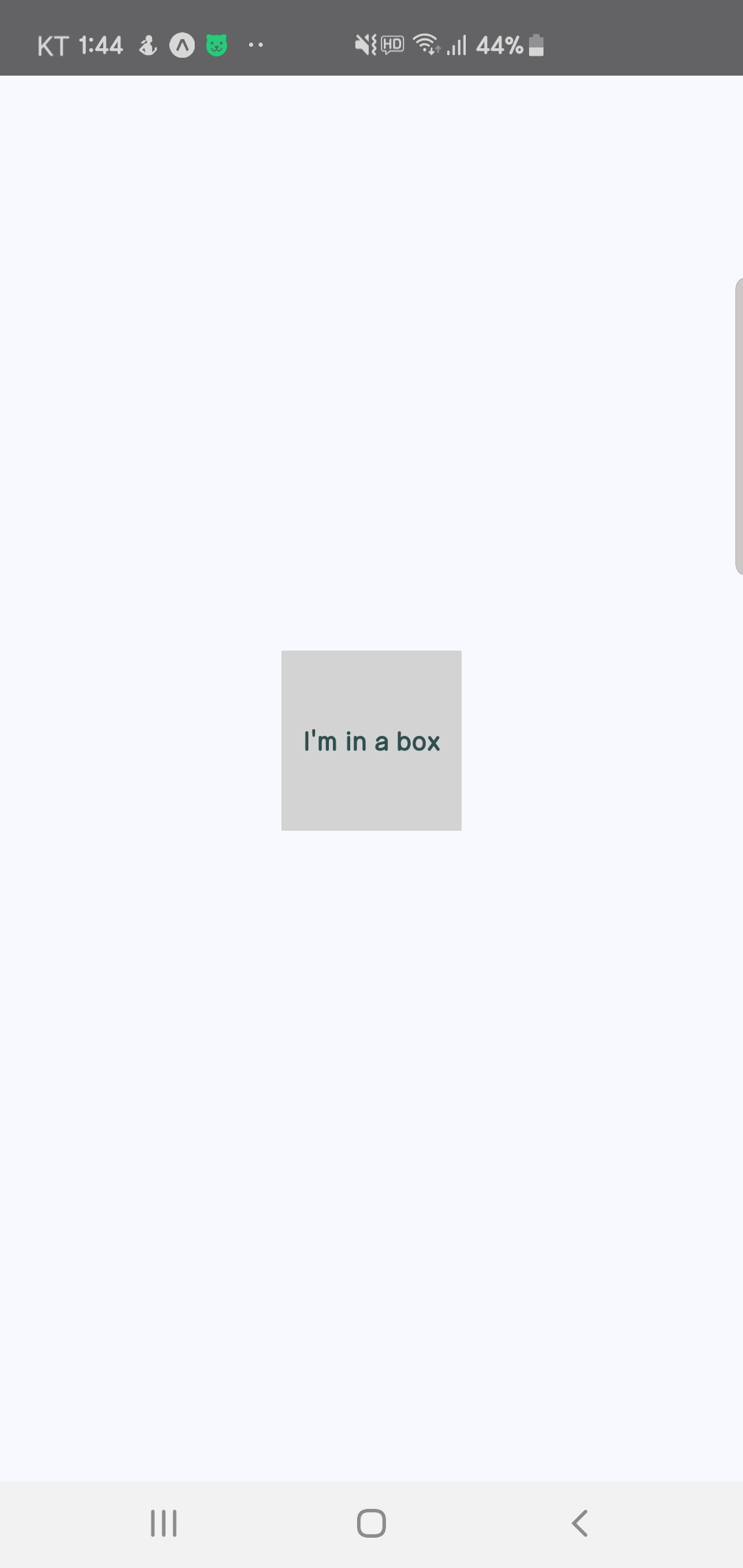
이 정도는 아직 감이 오질 않는다.
이번에는 단순히 세 열을 갖는 레이아웃을 구성해보자.
styles.js 수정
styles에서는 플렉스박스에게 자식을 어느 방향으로 그릴건지에 대한 설정, 간격을 다른 자식을 참고해 정의하는 설정, width 값을 변경하는 작업을 진행합니다.
import { StyleSheet } from 'react-native'

const styles = StyleSheet.create({
    container : {
        //플렉스박스 레이아웃 모델 활성화
        flex : 1,
        //플렉스박스에게 자식을 위에서 아래로 (vertical)로 그리도록 요청.
        flexDirection : 'column',
        //간격을 다른 자식을 참고해 정의한다.
        justifyContent : 'space-around',
        //자식을 컨테이너의 중앙에 맞춘다.
        alignItems : 'center',
        backgroundColor : 'ghostwhite',
    },
    box : {
        width : 300,
        height : 100,
        justifyContent : 'center',
        alignItems : 'center',
        backgroundColor : 'lightgray',
    },
    boxText : {
        color : 'darkslategray',
        fontWeight : 'bold',
    },
});

export default styles;
flex, flexDirection 프로퍼티는 행 레이아웃이 위에서 아래로 배치되도록 설정하는 프로퍼티이다.
그리고 alignItems, justifyContent 프로퍼티는 자식 요소를 컨테이너의 가운데 맞추고 주변에 공간을 각각 추가한다.
App.js
App.js에서는 3개의 뷰를 그려주면된다.
import React from 'react';

import{
  Text,
  View
} from 'react-native';
import styles from './styles'

const ThreeColumnLayout = () => (
  <View style = {styles.container}>
    <View style = {styles.box}>
      <Text style = {styles.boxText}>
        #1
      </Text>
    </View>

    <View style = {styles.box}>
      <Text style = {styles.boxText}>
        #2
      </Text>
    </View>

    <View style = {styles.box}>
      <Text style = {styles.boxText}>
        #3
      </Text>
    </View>
  </View>
)

export default ThreeColumnLayout
실행 결과

플렉스를 이용해서 안드로이드의 recyclerview를 구현한 느낌이다.
그렇다면 recylerview grid기능도 있지 않을까?
styles.js
styles에서는 Platform.select라는 기능을 추가했다.
눈으로 보기에도 ios, android 플랫폼에 따라서 각각 프로퍼티를 세팅해줄 수 있다.
import { Platform,StyleSheet,StatusBar } from 'react-native'

const styles = StyleSheet.create({
    container : {
        //플렉스박스 레이아웃 모델 활성화
        flex : 1,
        //플렉스박스에게 자식을 위에서 아래로 (vertical)로 그리도록 요청.
        flexDirection : 'column',
        //간격을 다른 자식을 참고해 정의한다.
        justifyContent : 'space-around',
        //자식을 컨테이너의 중앙에 맞춘다.
        alignItems : 'center',
        backgroundColor : 'ghostwhite',
        ...Platform.select({
            ios : { paddingTop : 20 },
            android : { paddingTop:StatusBar.currentHeight}
        })
    },
    box : {
        width : 100,
        height : 100,
        justifyContent : 'center',
        alignItems : 'center',
        backgroundColor : 'lightgray',
        borderWidth : 1,
        borderStyle : 'dashed',
        borderColor : 'darkslategray',
        margin : 10
    },
    boxText : {
        color : 'darkslategray',
        fontWeight : 'bold',
    },
});

export default styles;
참고자료 : 리액트&리액트 네이티브 통합교과서